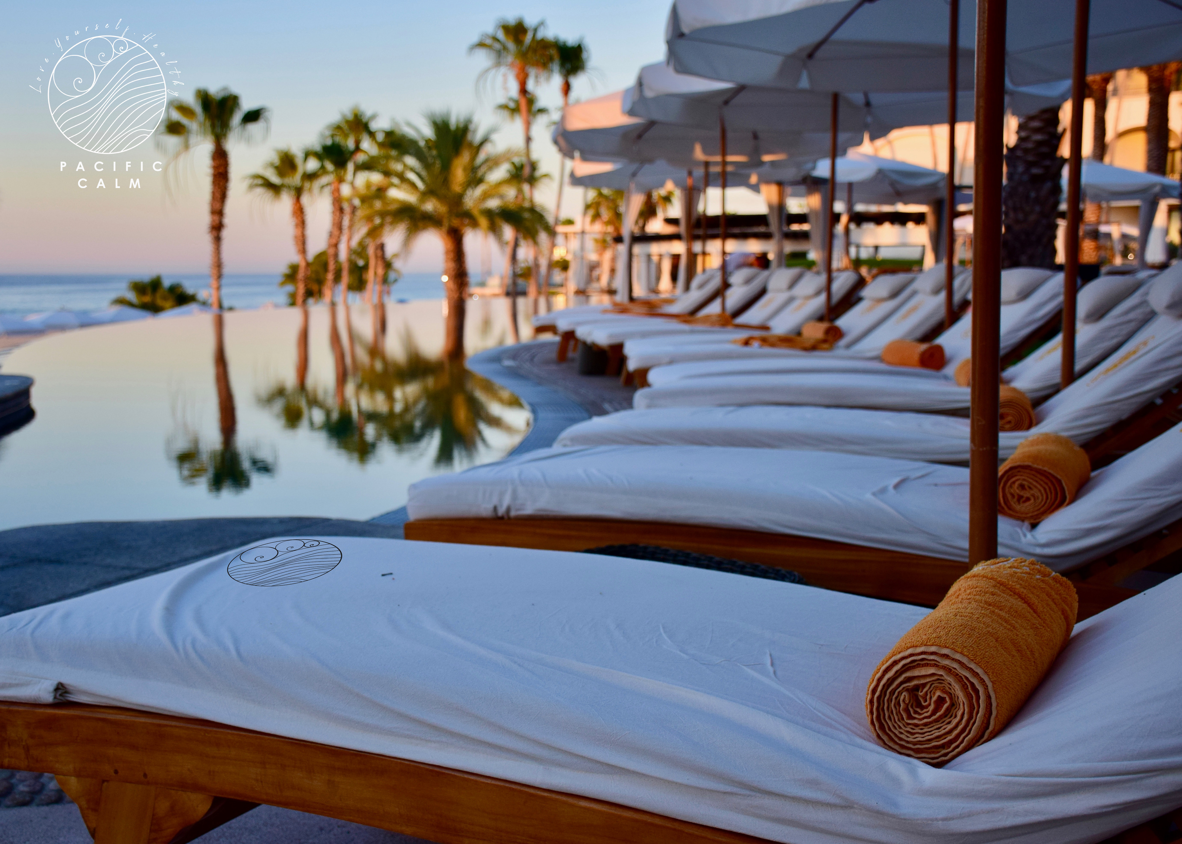
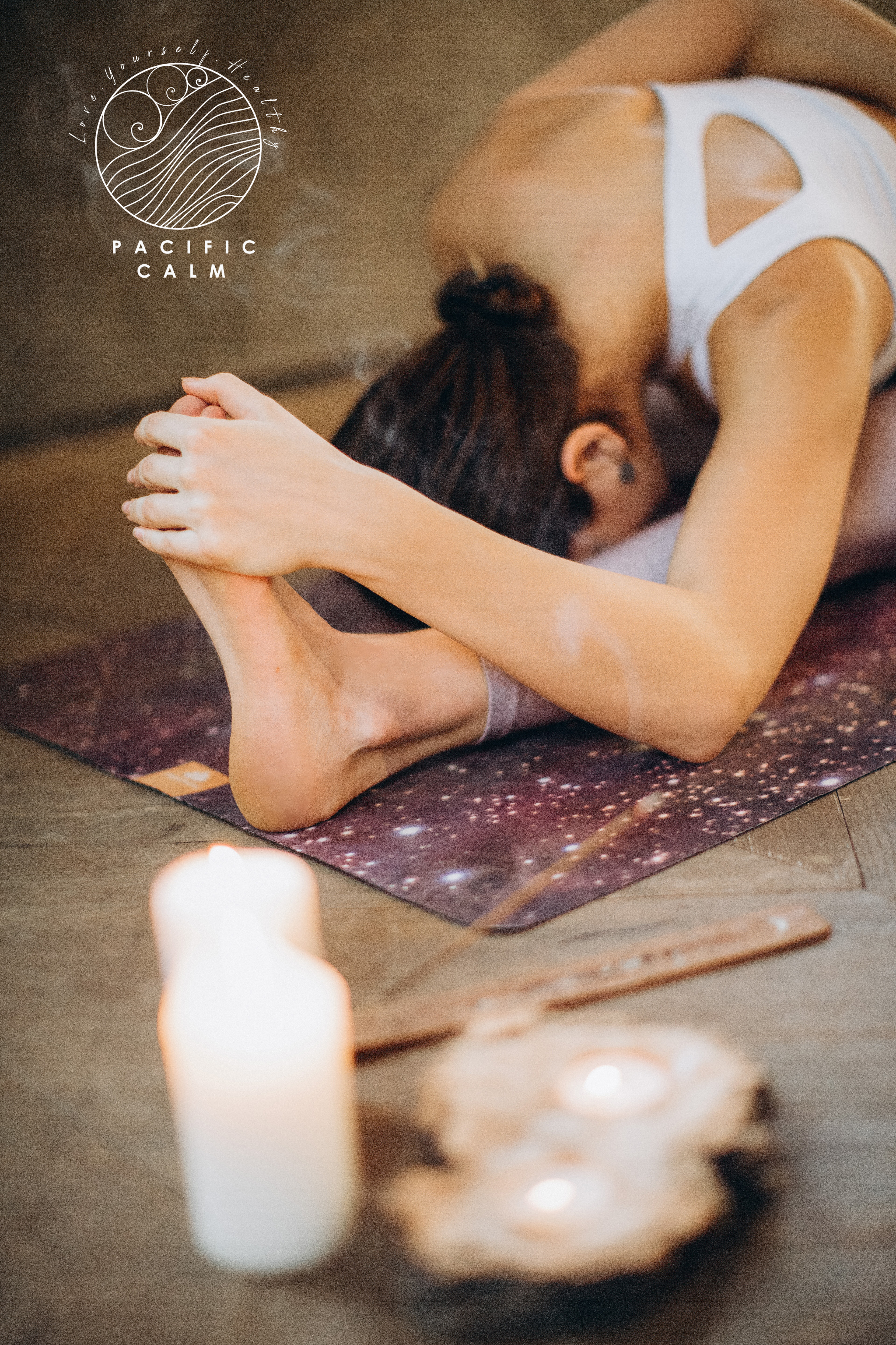
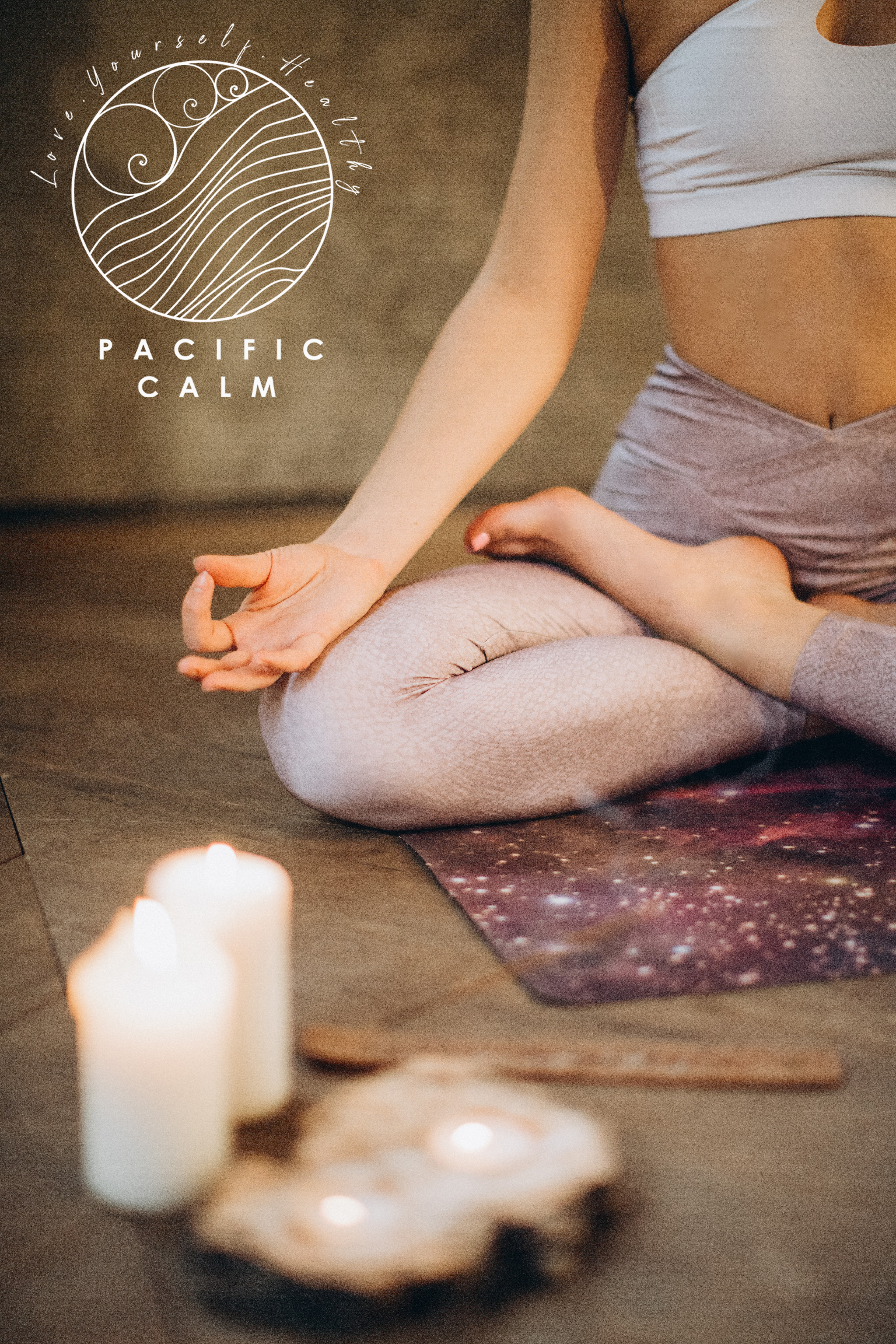
Logo Design & Branding for Pacific Calm
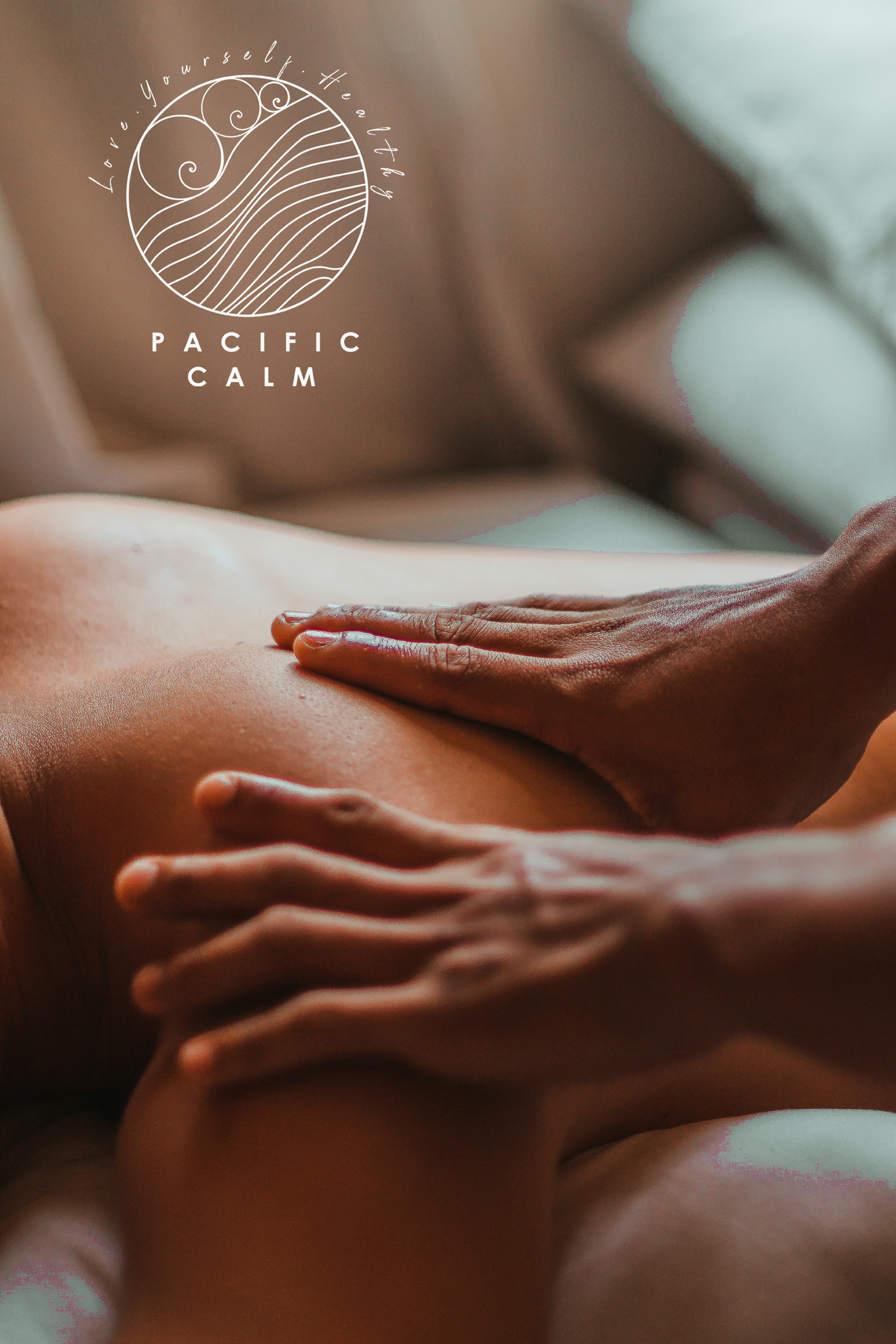
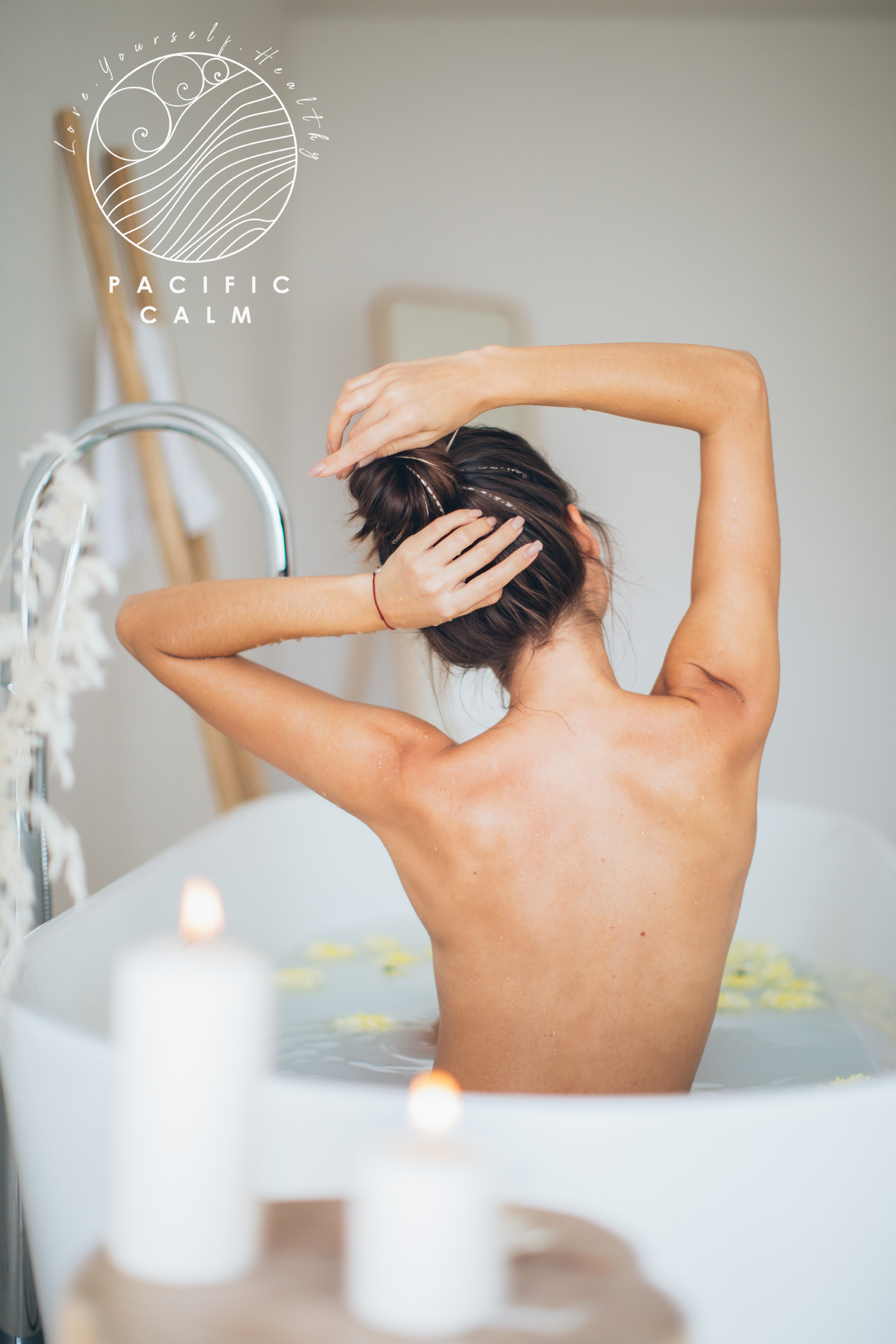
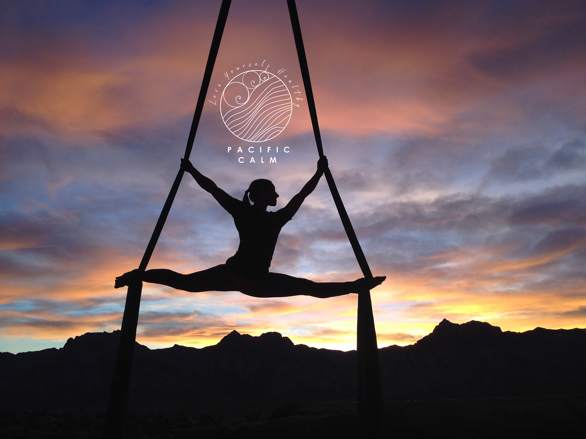
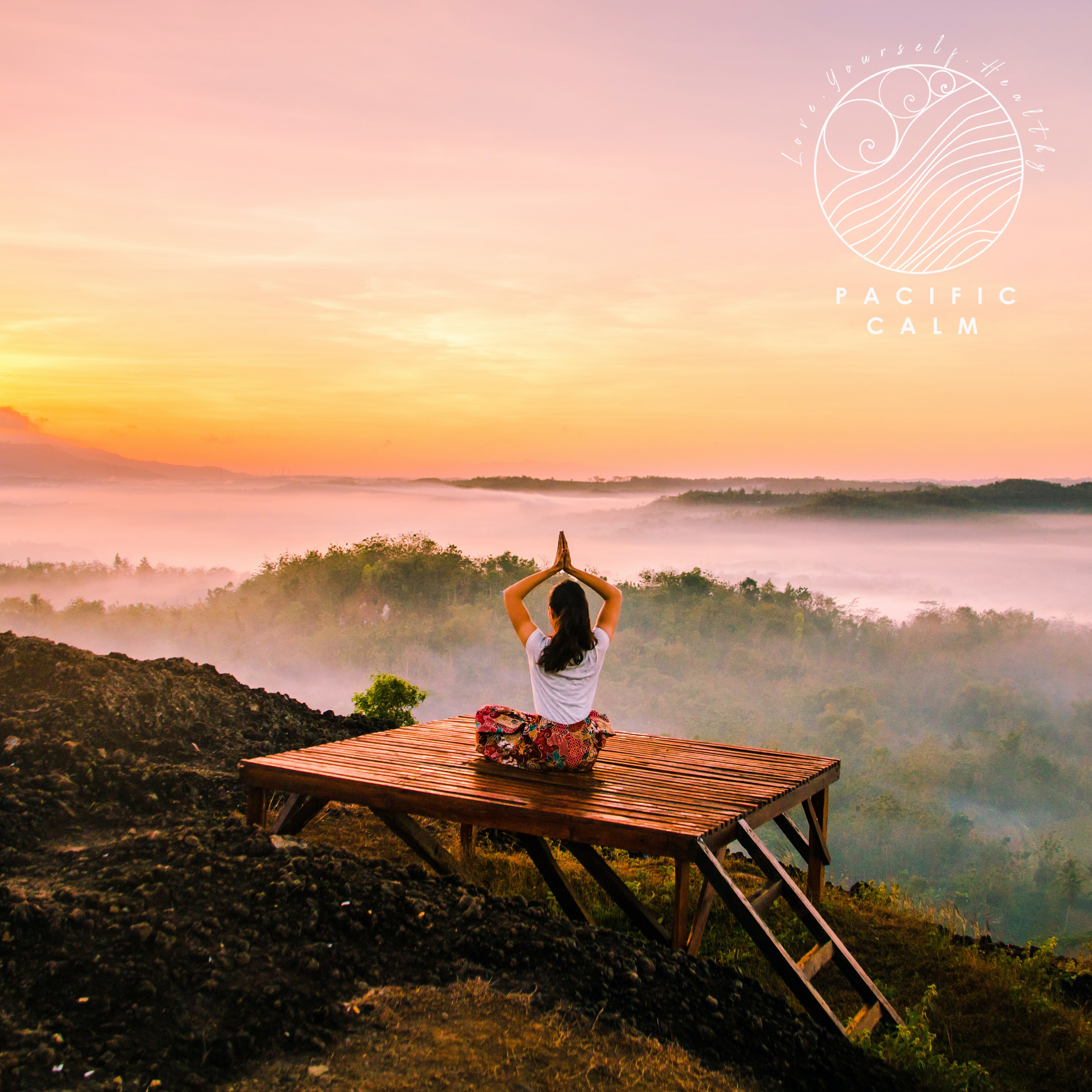
Pacific Calm is a Health Club & SPA which brings its customers closer to the nature and the ocean. Multifunctional gym offers exercises classes, yoga, meditation sessions and SPA services. The club want to provide the services that reduce stress and anxiety. The major focus stands on a many water-based exercises.
The target group are women of all age. That is why the client would like to highlight their feminine side. They do not want to be seen just as a SPA. They would like to promote the entire atmosphere and idea of wellbeing, mindfulness, healthy lifestyle and happiness.
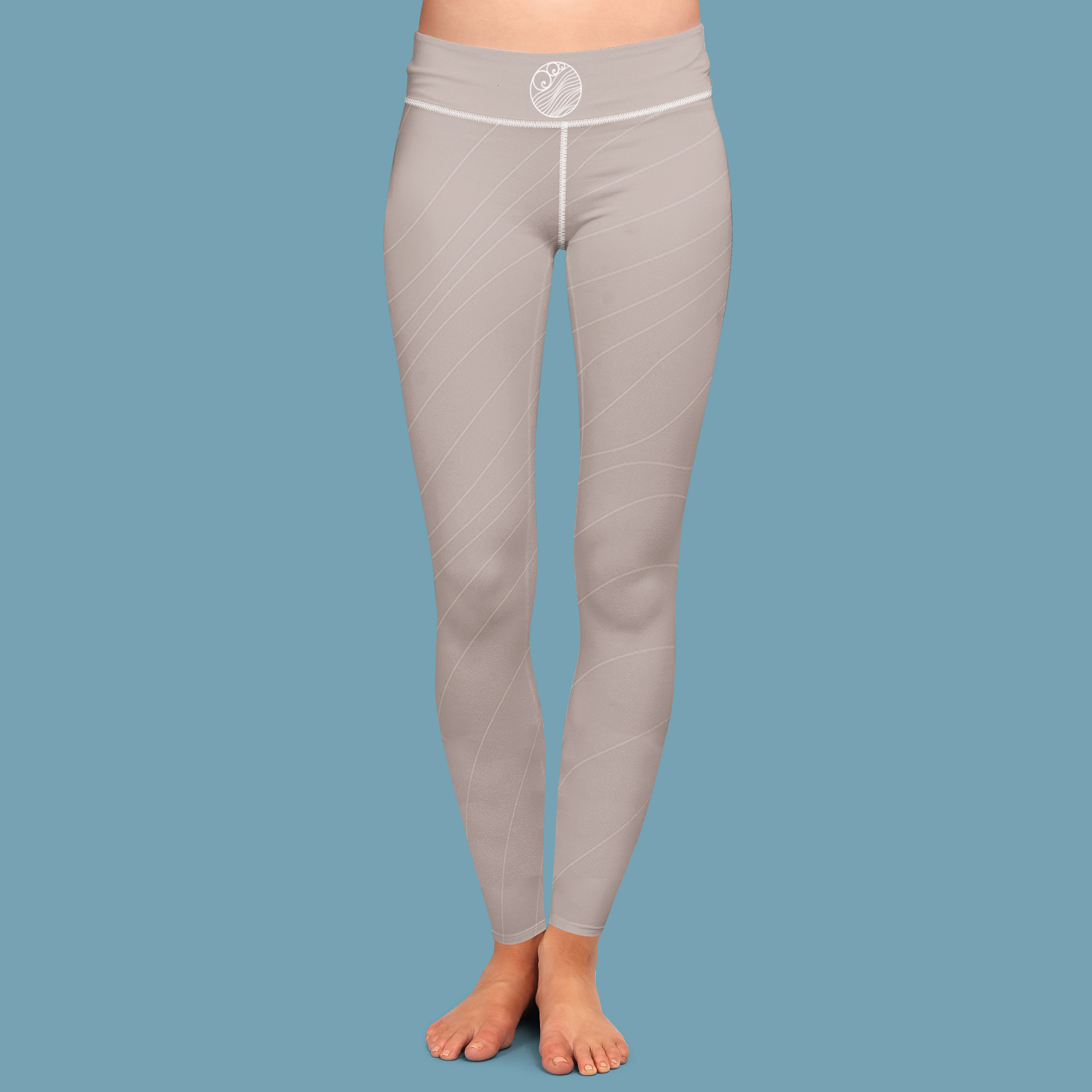
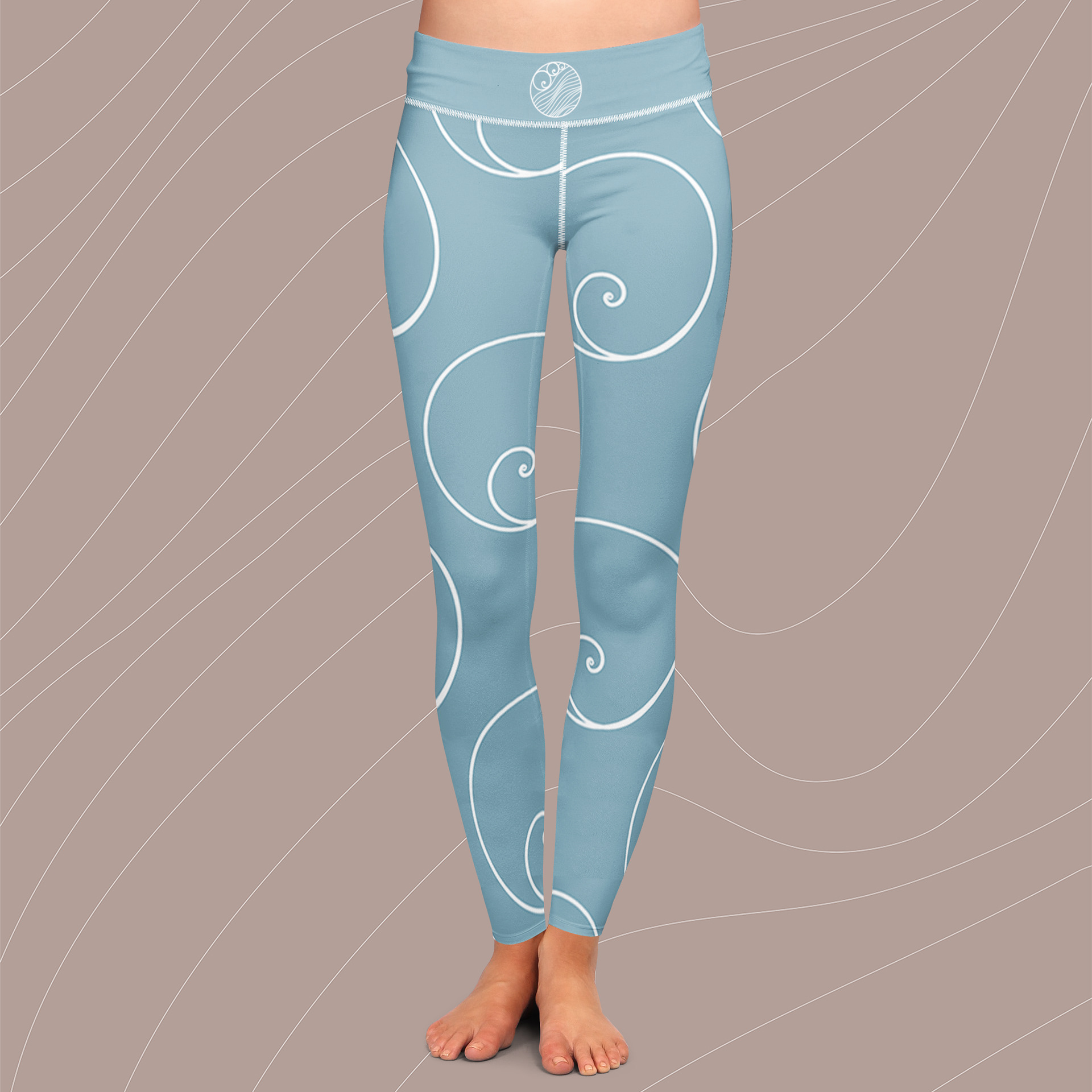
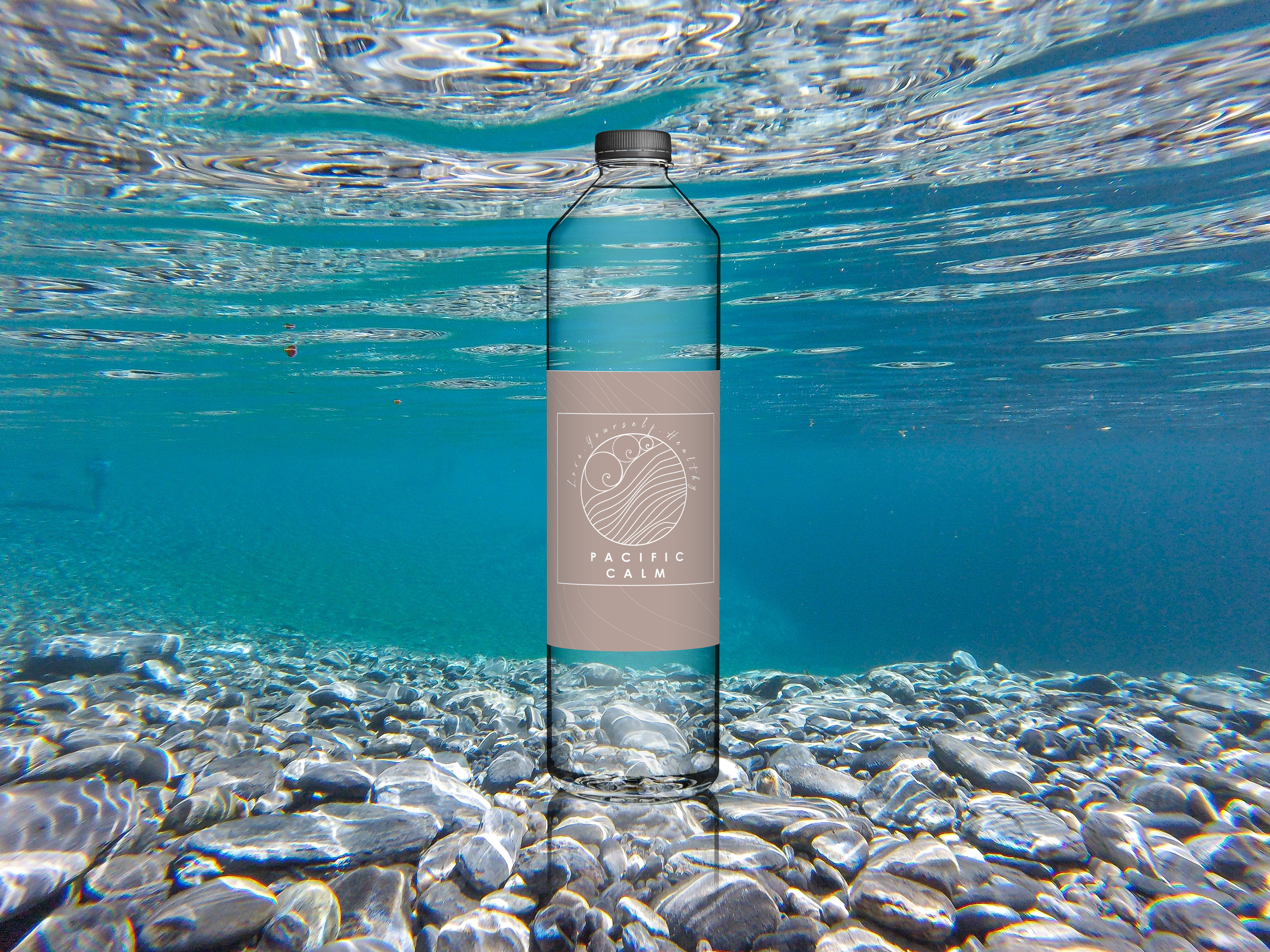
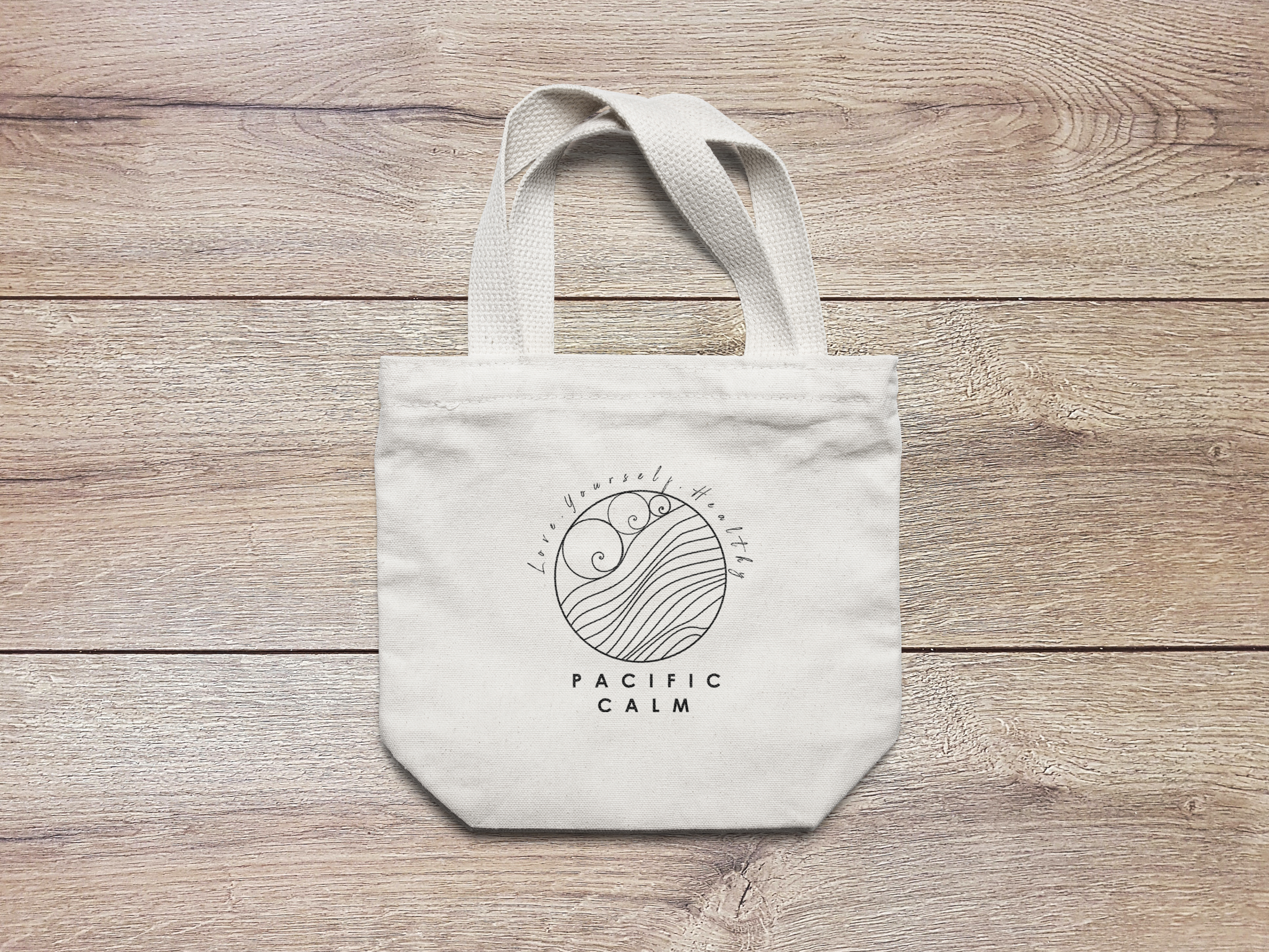
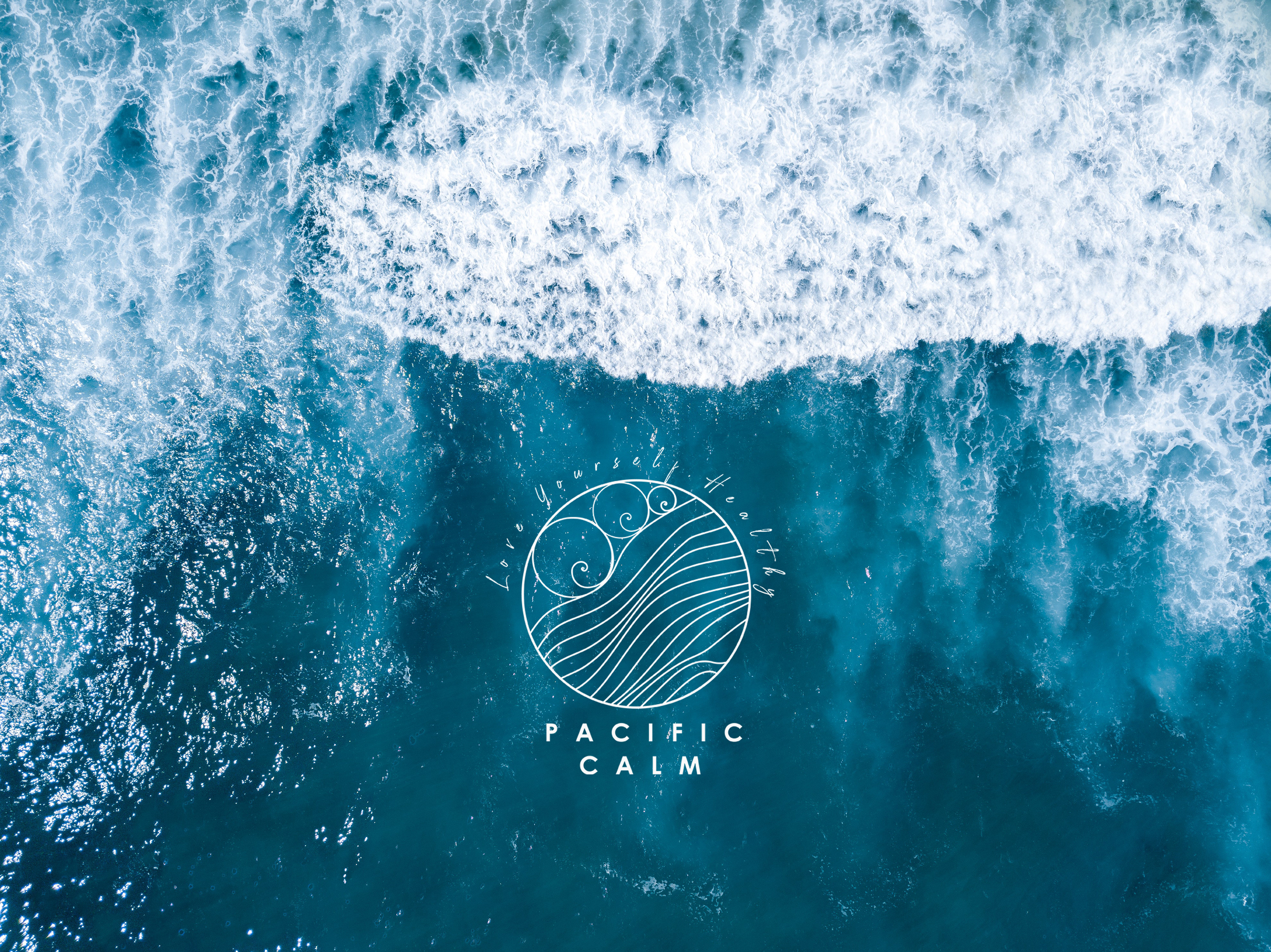
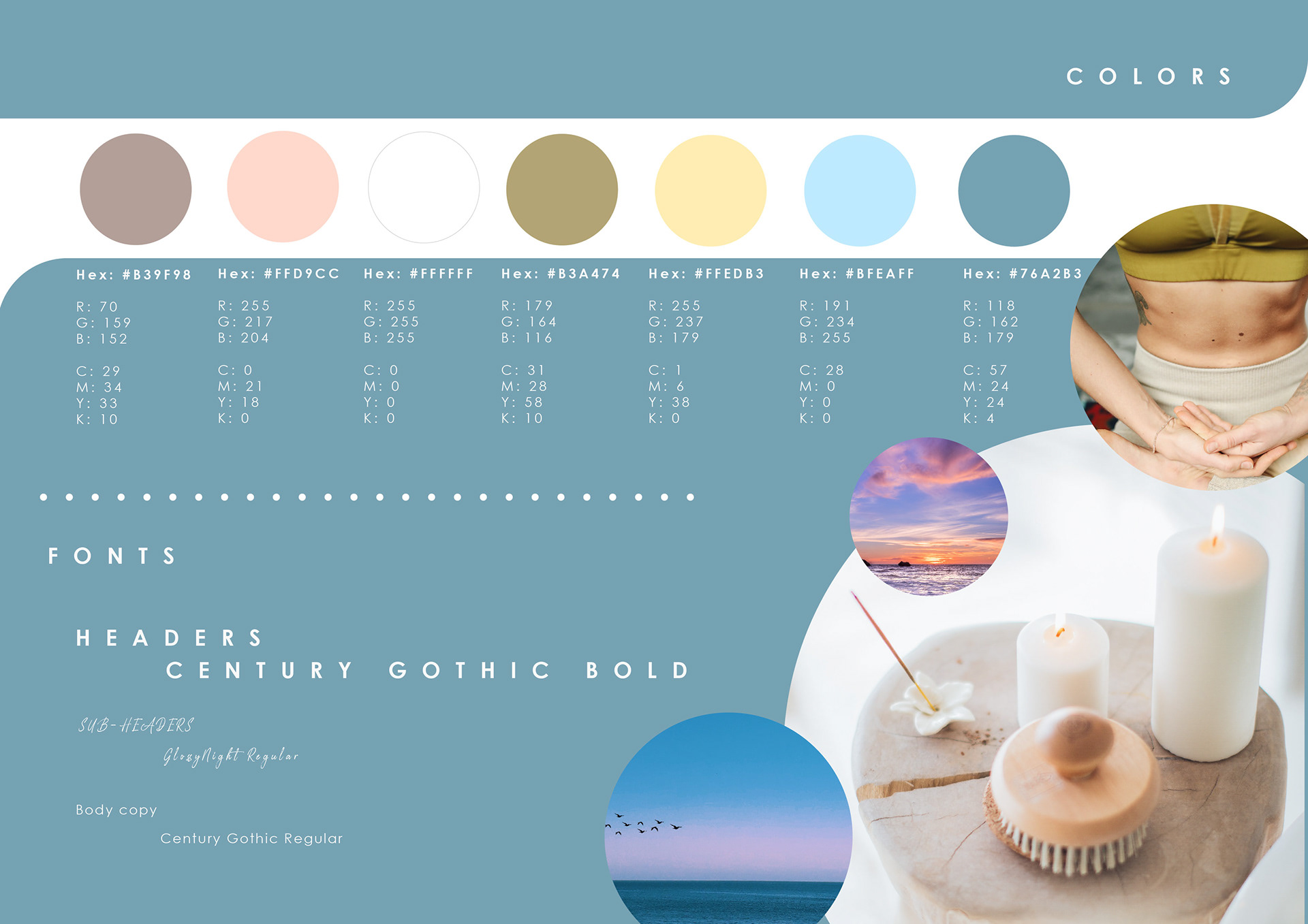
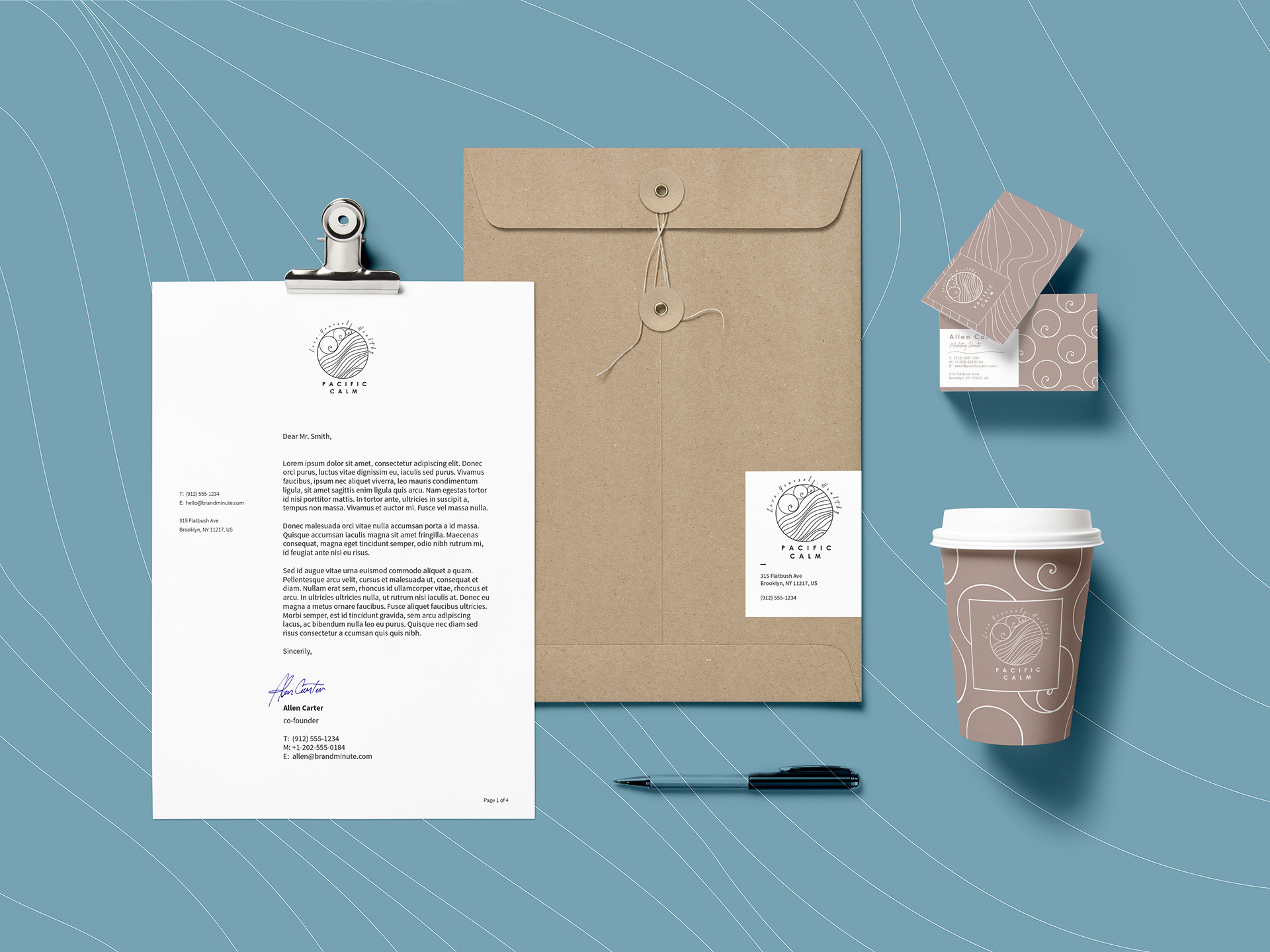
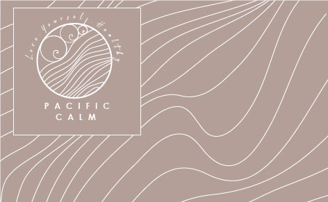
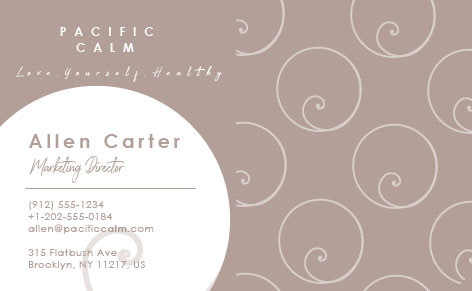
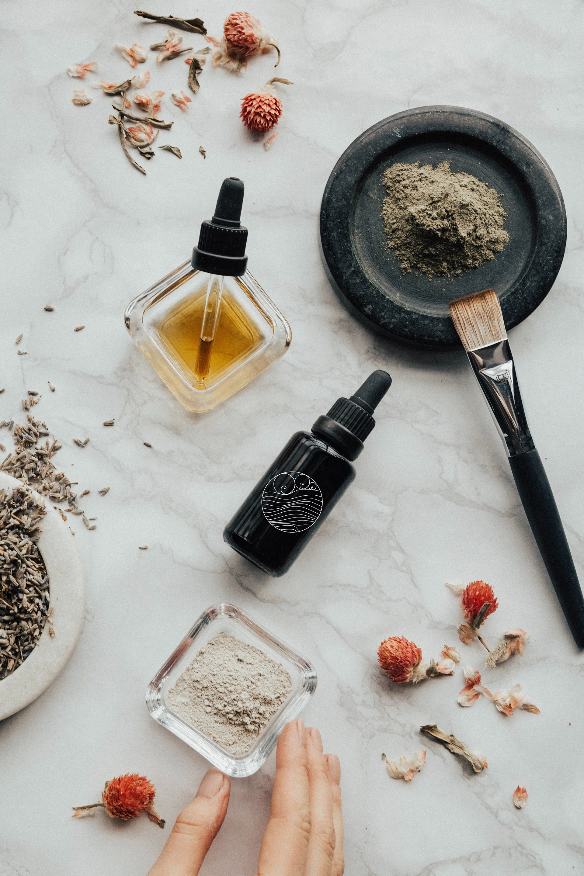
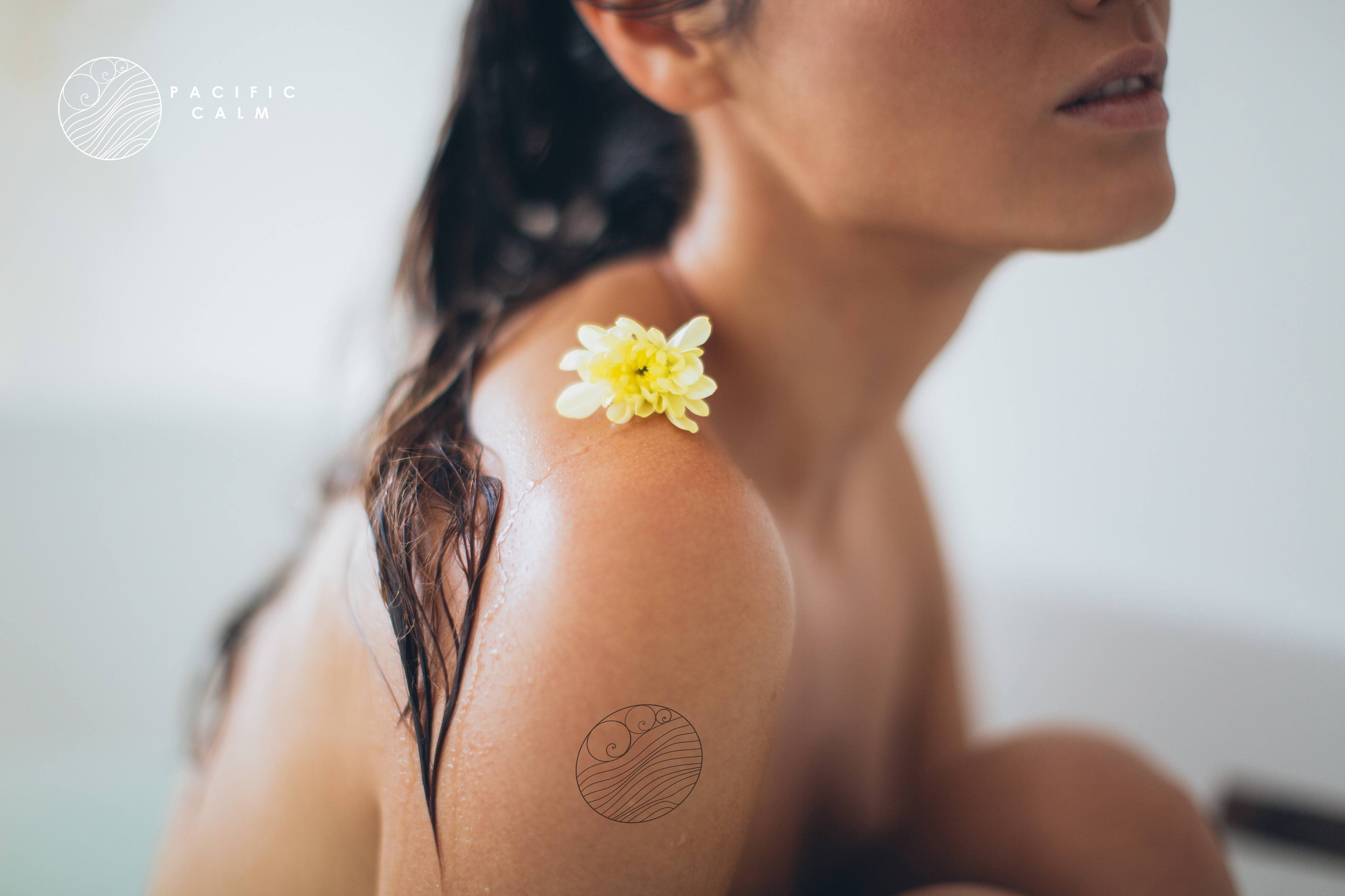
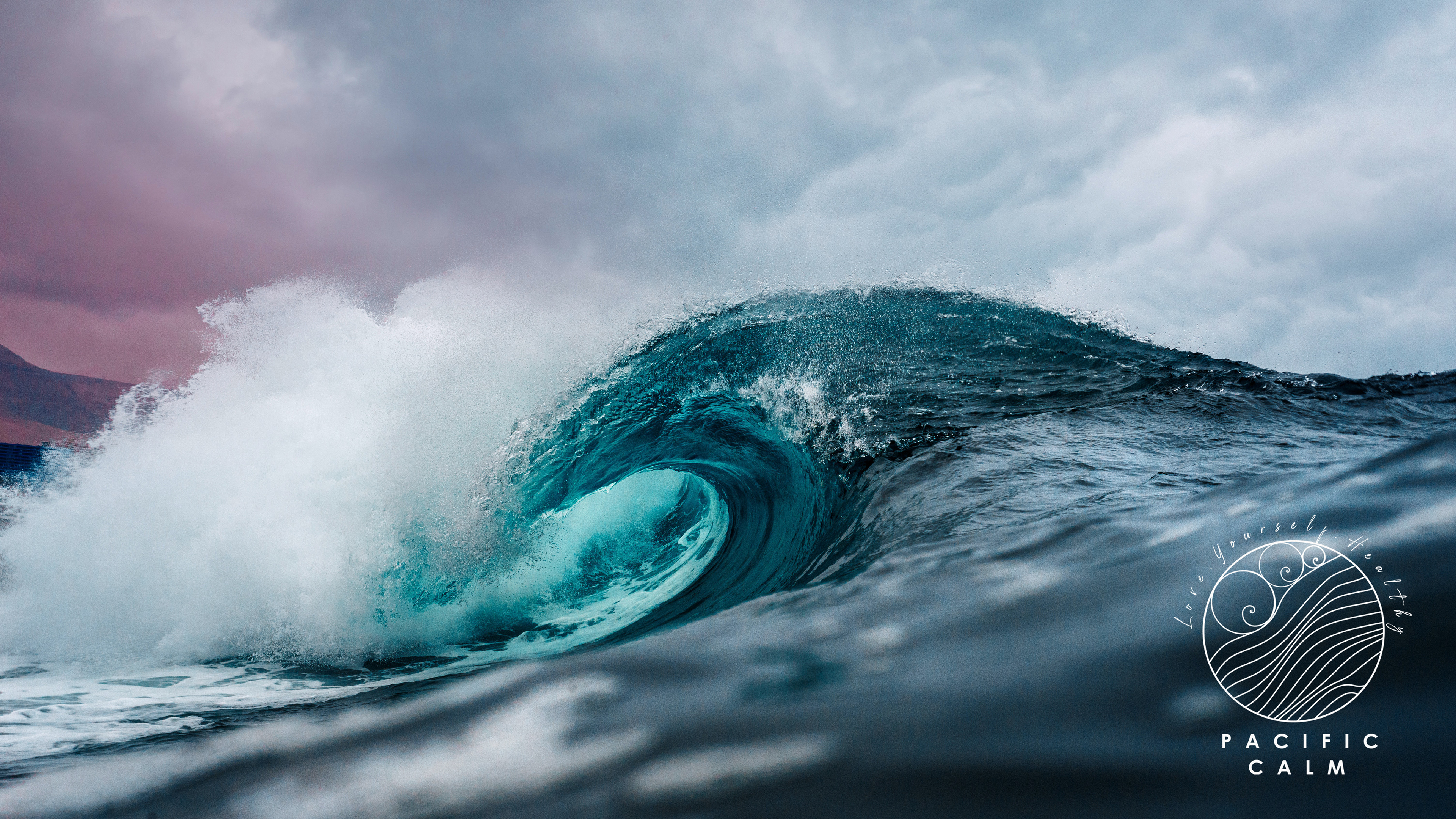
I was pleased to present my vision of Pacific Calm by designing a symbolistic logo and branding image with which women are identifying themselves. The logo represents water waves, the minimalistic typography and dominant color in the logo - white - stands for calmness and peaceful of the place. As primary colors and secondary colors, inspired by nature, I have chosen pastel blue, and few shades of pink, yellow and green - colors of the water, sand and the sky during the sunset. I have used "golden ratio" technique with designing the logo - its waves spirals and main circle. I used those circular spirals as patterns in branding materials, such as background for the cups, leggings or business cards.
Love. Yourself. Healthy.

Role in the project: Creative Director / Graphic Designer
Personal work created by Martyna Gabala | All Rights Reserved | 2020